Wednesday, December 31, 2008

NEW Grey Frame By Me

Now I am not that great at this stuff but I was making a tag
and put some stuff together with scrap things snagged over time and
well it became a frame lol.

Nothing special but hey its a start right?
Enjoy if you use, and I would love comments if you download so I know its being snagged at least please!! TY
Download here


Tuesday, December 16, 2008

Making An Avatar Tutorial

Ok for this tutorial, I got this one from a challenge in a group, the one that explained how to do it, had me confused and well, I stopped and just went my own and revised it to my likeing and hopefully better to understand, I will completely give credit to the link.

Supplies need
All in supplies here
Credit to this site here for the idea of my tut.
open up a blank image of 100*100
ok then open a 41*101 and set it aside for now
then in the 100*100 one,
take your picture you are using and paste as a new layer
once that is pasted, if its too big and you can't use it as is pasted,

i resized once with 40% smartsize,
all layers not checked,
on top on psp you will see adjust, go there, then you will see when the menu pulls down, brightness and contrast
find the one that says histogram stretch
just click it and it does it for you automatically
then under adjust again, you will find automatic color balanceopen that up
strength= 72 and temperature= 4639, UNLESS you want to fool around and do it your own number for the temp merge visible both layers
once its merged, on top of psp you will see layers, click that and you find duplicate,

click that once
once you duplicate it once, do it one more time
ok, on the materials again, you will see 3 layers, merged, copy of merged 1 and copy of merged 2, right?ok, click the middle layer on top of the merged
ok, back to adjust, then you will see blur, when that opens, click the blur one once, you won't see it being done but its doing it lol
then back on the materials with the layers, the one that has 100, lower that to about 54%same layer
then click the top copy layered and you will see were it says normal
click on the normal and find the soft light option ok, merge visible again
set this image aside for now
take your 41*101 image we made
same picture too
take the picture you have and paste it into the 41*101 as new layer
take your mover tool

and move the pic around to the part you want showing
depending on the size, i did mine once at 40% smartsize, all layers NOT checked
if that makes it too small adjust the number size
then use your move tool (hit m on keyboard) and move the layer around to what you want showing
once happy, merge visble both layers
repeat the same step for the brightness and contrast, under adjust, once there, click the histogram stretch
then back to adjust and click on automatic color balance, same settings as before
merge visible both layers
this part is optional

Mirror if you want, depending were your placing the 41*101 image
back to layers on top of psp and click that,
find duplicate again, click it, do it again, to have 2 layers
click the middle layer
back to adjust, then same blur as before
and lower it down to 54% again in the material boxes
then top layer, click on that, then click on normal and find soft light again and click on that. Once you finish that, merge visble again.
repeat the brightness and contrast again, same histogram stretch one
automatic color balance, same settings as before
copy this image
once it copied, bring your 100*100 back up and paste as new layer on there
ok now this part is totally on how your images look.
your first layer, the 100*100 one, move that slighty over, to either the right or left a littleto where it isn't overlaping depending were your going to place your 41*101 one just move it to what you want to show ok, now back to the 41*101 layer
move this layer some so its not overlapping your other image, enough so no background will show and line them up.
if you need the other one moved, do it, so it lines up nice.
merge visble
Find your pen tool, click that
pick a color that goes with your image but a tad darker
line style is solid, make sure its on that, width = 3.00
once that is set, click back to your image, hold shift down and draw a line were the two images meet, then convert to raster
make a new layer
now the color you picked, flood fill with your color you picked on the new layer
add new raster layer
flood fill this with your next color, which should be light
on your DARK color, click on normal in this layer and change it to screenon your LIGHT color, change the normal to hard light
now click shift D together so your image duplicates as allset aside your originaland stay on the duplicate one
merge visble the duplicate image all layers together once that is done,
click shift T together
then do the same automatic color balance, same settings
copy the image we just fixed
click your other 100*100
select the light color layer, paste it as new layer on there
so its between the dark color and then light color is below it
change that layer from normal to Luminance legacy
make a new raster layer again
pick another color, that goes with your others but not too dark and not too light,
does NOT have to be gradient
I used a solid color. Flood fill the new layer with this color.
change this layer from normal to screen
after you change it to screen, click this layer in materials and drag below the dark color
staying on this layer we just dragged, take the brush image you saved, either open it or if its opened, copy it, paste into this layer as paste into selection
change the brush/color layer from normal to screen
Lower this layer to about 50, play around to what you like
ok copy the border pic from supplies
paste as new raster layer on your 100*100 your working on
so its the first layer, we don't move it
change the normal to overlay
play around with any of them till you like it for your colors
merge all layers visble

Font time
i used Trebuchet MS
size 1
no stroke, bold,
anti-alias on sharp, kerning 100
color white unless you want different, this text we won't be able to read,

but it makes it look neat
type out anything you want that goes with the pic
once your done
convert to raster, then add drop shadow with these settings
V&H = 1 Opacity = 93 Blur = 1.00 and color is blk

Add anything else you want and your done :) Hope you enjoy.

Tuesday, December 9, 2008

Live Tutorial

Supplies Needed
1 Graphic of choice
The one I used Here
Elements of Choice (at least 2)
(Ribbon and Bow)
Doodle of choice (just one)
Font Of Choice
Frame By Me Here
Other supplies Here
Word art of choice or one I used by
Kimmy (KLS_WA)
Here
(a little comment doesn't hurt if you download.)
Scrap kit of Choice
The one I used is
Sagittarius PTU kit by Stacey's Designs
and I can't provide it.
You may purchase it at her sites and browse her other great kits.
http://snmcreationz.blogspot.com/
http://www.staceysdesigns.us/

Open new image 650*400
we will resize later
Take the frame I provided
paste as a new layer on your new image we just made
Take your magic wand and click inside the frame
expand by 2
Take your graphic you are using or the one I put in the supplies
choosing your own, makes the tag more of your design :)
paste as a new layer
I resized mine @ 70% smartsize with all layers NOT checked
I did this 3 times,
it depends on your graphic you use or to what you like.
Then use Unsharpen mask with these settings
(this is under adjust then sharpen)
Radius-1.00 Strength-64 Clipping-4
I did this twice
Click invert, then delete, then invert again, select none.
Make sure you bring this graphic below the frame layer.

I then gave my frame layer a drop shadow with these settings
V&H-1 Opacity-100 Blur-3.00 color-blk
Just once.
Then for my graphic again, this is optional, totally up to you.
I used the filter factory J plugin and then toners
and used these settings to give my graphic a little something.
Red- 9 Green-14 Blue- 15
If you do this, I did this twice with the same settings,
I encourge to play around with the settings, have fun with it :)

Time to add stuff to your tag.

Now for the supplies I did provide I will explain how I did those, any other supplies you do use, you can just look at my example and wing it with which ever you use.

Open the live tutorial supplies you downloaded
Take the staple layer and copy. Pase this on your image you just made with the graphic.
I resized mine once @ 40% smartsize and used the same unsharpen settings as before.
I then duplicated once, then merged down together, Just the staples nothing else.
I then duplicated again and flipped once.
Look at my example for placing or place how you like.

In the same supplies take the note book paper layer, copy. Paste this on your image and I resized this layer @ 60% smartsize once, same unsharpen settings as before once.
I added the same drop shadow as I did the frame before.
I duplicated this once, them merged together the 2 layers, then duplicated again and then I flipped it this time and then mirrored. Look at my example for placement or place how you like.

This part of the tag making is up to you.
Take the ribbon of choice you are going to use and paste on your image we are creating.

I resized mine at 60% smartsize, judge your sizing by the ribbon you picked.
Same sharpen settings as before.
I also colored my supplies to match my graphic, you can do the same or leave them as is.

Open up the bow of choice you are using and resize to your liking and place in the top left corner like mine above or to were ever you like :)

The word art I provided or one you picked, open this up, I merged the layers together on the one I used and resized it once @ 60% smartsize once and colored mine white.
I added the same drop shadow as before. Then duplicated it once so it pops out more. Then merged those layers together, just the word art layers.
If using another, please resize it to your liking or what looks best.

Open doodle of choice (if you use one) and paste as a new layer, for the one I used, I resized it once @ 40% smartsize, do to your liking if you want.
I colored mine again to match the tag.
Then added a drop shadow with these settings
V&H- 1 Opacity- 100 Blur- 1.00 color- Blk
Duplicate the doodle once, merge together these 2 layers, then duplicate again. I then flipped it and mirrored to place it on the other side, Adjust so its peeking out just some.

Once you are done and happy with your results, pick a font and add your name or anything else you might want and add any copyright/watermark info and save. Make sure you crop out the excess background or resize the tag to your liking, I cropped mine.

And you are done, I hope you enjoyed the tutorial.

Update

Hello everyone
I've been a bad tutorial writer lol, I haven't had a new one come to me since my last post in October, been so busy with other things.
I am working on one right now tho and it should be posted soon, thanks for understanding and thanks for still being interesting in my tuts.
Happy Holidays!!
Hugs
Kelly

Tuesday, October 28, 2008

Scrap Frame Tutorial

Scrap Frame Tutorial
Written By: KMLDesignz
October 28th 2008

Supplies Needed
Scrap supplies of choice.
Filter Factory J plugin with toners (optional)
1 paper, some elements, 1 ribbon.
Scrap pieces I used are supplies.
Font of choice.
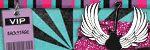
3 Images of Choice, Bigger the better.
Mask supplied
Template 20 from Cheri's bloghttp://WildCreationz.blogspot.com
Supplies Here

Let's Get Started
Open up the supplies given and minimize them for now, take the template and open up that, duplicate it and close out the original, we won't need it anymore.
Delete the watermark layer, Close off the background layer, Delete the light grey squares as we won't need them. Hide the dark square layer.
Hide both left and right rectangles. Use your magic want and click inside the circle frame.
Expand by 9
Take your first graphic of choice and copy and paste as a new layer, resize this down some, so it fits nice in the circle frame, Sharpen using the unsharpen mask with these settings
Radius- 1.00 Strength- 64 Clipping- 4.00
Do atleast twice or which ever looks best for your graphic.
Select invert, then delete and invert again. Bring this layer below your circle frame.
For mine I did the filter factory J plugin with toners with these settings
Red- 16 Green- 14 Blue- 44
I did this 3 times for mine, do this to your liking.
Repeat these steps for the following 2 graphics left for the right and left rectangles.
Give each of the frames a drop shadow with these settings
V&H- 1 Opacity-100 Blur- 3.00 Color- BLK
Merge visble the frames and graphics together.
I resized mine @ 70% smartsize and used the same sharpen settings as before.
Open back up the dark gray square and resize this @ 70% smartsize too.
Open up the paper in the supplies or one of your choice. If using the one I supplied
I colored this to match my tag, you can do the same.
Take your magic wand and click inside the dark gray square, you might need to close out the frames so its fully selected for the square or easier way, click the square layer, select all, float, defloat, copy and paste the paper your using, I sharpened mine once with the same settings as before, you don't have to do this if you don't want to, invert, delete then invert again. Select none.
Add the same drop shadow to this layer but repeat with -1 for the V&H
You can now delete off the dark gray square, we don't need it anymore.
Open back up your merged frame layers.

Time to decorate the tag.
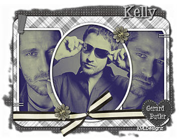
In the supplies, open up the heart layer, copy and paste on your image, I colored it to match my tag, you can leave it as is if you like. I resized this @ 35% smartsize once and used the same sharpen settings as before, place this in the bottom right corner of the tag, look at my sample for placement. Or you can place were you like.
Open up the ribbon I supplied or one of your choice, paste as a new layer on your image. If your using your own, resize to your liking but make sure it fits nicely on the tag like mine above. If your using the one I supplied, resize this @ 15% once, then 75% once, then 85% once, use the same sharpen as before, I colored it to match my tag. You can do the same or leave as is.
Bring this layer below the heart layer but above everything else.
Give this a drop shadow with these settings
V&H- 1 Opacity-100 Blur-3.00 Color- BLK
Take the star layer and paste that onto your image, I resized mine @ 50% smartsize once and colored it to match, You can do this to your liking. Then give it the same drop shadow as the ribbon.
I duplicated this a couple times and placed them in different spots on the tag, look at sample for placement or you can opt out for this part and leave just one on the other end of the ribbon.
Take the notebook paper layer and paste as a new layer on your image.
Resize this @ 50% smartsize once, give it the same drop shadow as before. Duplicate this one, mirror then flip it so its on the other side peeking out, look at sample for placement. Any of the paper peeking out on top just move it down some so the its not showing.
Take the same notebook paper from the supplies and paste as a new layer again, this resize it @ 70% once and add the same drop shadow, rotate this @ 90 to the left and make it peek out some on the bottom of the tag, then duplicate once and flip it so its peeking some out of the top of the tag. Bring all these layers below the frame layer but above the square layer.
You can merge them together so they don't move when adding more supplies. Just make sure its ONLY the notebook papers merged together.
Take the splat layer in the supplies and paste as a new layer, I colored mine to match, you can do the same or leave as is, Resize this @ 65% smartsize once, use same sharpen settings as before and give it the same drop shadow.
I duplicated this so its on the other side, look at sample for placement. I mirrored it once, then flipped it, then mirror again, then flip. and placed it on the top right corner and one in the bottom left corner. Make sure these layers are above the notebook paper but behind the other elements and above the square.
Take the diamond layer and paste as a new layer, I colored mine again to match, you can leave as is or do the same. Resize this layer @ 70% smartsize once, sharpen with same settings as before, I mirrored it then flipped it and placed on the left side, duplicate and mirror so one is on the right side as well, give it the same drop shadow as before. Make sure this layer is above the splats.
Now for this step its pretty easy.
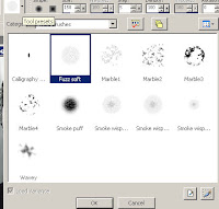
The background layer is white, click on this layer and flood fill this with a color that goes with your tag, Take the mask I provided and apply to this layer. Delete mask raster, then merge group. Resize this layer @ 85% smartsize once, sharpen as before. Then go to effects, texture effects and find texture. Apply the texture named canvas coarse with these settings
Size-26% Shininess-0 Depth- 1 Ambience-0 Smoothness-0 Angle-315 Intensity-50
Elevation-30 Color- white. Apply this once.
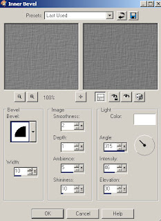
Add an inner bevel with these settings
Bevel #2 Width-10 Smoothness-2 Depth-1 Ambience-5 Shininess-10 Angel-315
Intensity-62 Elevation-30 Color- #c0c0ff
Apply this once.
Go back to effects, Texture effects, then weave and use these settings
Gap Size- 1 Width-4 Opacity-10 Both colors-white Fill gaps Checked.
Apply this one.
Give it the same drop shadow as before.
Merge all layers expect the layer with your mask on it.
I resized this layer @ 75% smartsize once and used the same sharpen as before, Then repeat resizing your mask layer.
Now for this next step its only if you used a celebrity or you can add a word to it if its non celeb.
On top of the heart, type out the celeb name or word your going to use, look at sample for size.
Go to effects, then 3D effects and click on cut out and use these settings
Offset V&H-2 Shadow Color- white Opacity-90 Blur-15.00 Fill NOT checked.
Apply once.
Add drop shadow as before. Then duplicate this layer 3 times, then merge those together and it looks like its cut out of the heart :)
Add anything else you might like.
Add your name to the tag and any copyright/watermark info and save.
Hope you enjoyed the tutorial.
Other samples of this tutorial :)


Wednesday, October 22, 2008

Scrap Tutorial

Scrap Tutorial Written By KMLDesignz
October 22nd 2008


Supplies Needed
Scrap elements of choice or ones in the supplies
1 Graphic of Choice or one in supplies
Font Of Choice
Mask in the supplies
Plugin Xenoflex 1.0 Crumble
Filter Factory J Plugin Toners
You can get those here, go to F and then X
Supplies Here


Let's Get Started
Open up the supplies and minimize them in psp

Open up a new image 600*400, you can resize later if you want.
Open up the image of choice and copy and paste as a new layer, resize this to your liking, then use the unsharpen mask with these settings
Radius- 1.00 Strength- 64 Clipping- 4.00
Do this at least 2 times to your image.
I then added the Filter Factory Toners to my image with these settings
Red- 19 Blue- 44 Green- 14
I did this like 3 times to make it look cloudy.


Open up the SBS_WPO2_RoundedWhite.png and copy and paste this on your image as a new layer, I resized mine @ 50% smartsize size till it fit nicely around the image your using, then I used the same unsharpen mask settings as before, then I duplicated this layer 2 times merge those layers together, add a drop shadow with these settings

V&H- 1 Opacity- 100 Blur- 3.00 Color- Blk

Then lower this layer to like 76 in the layers.


Open up 1.png and paste as a new layer, resize this layer @ 70% smartsize and sharpen with the same settings as before then use your deform tool so it fits nicely behind your image, now go to your Xenoflex plugin and choose crumble with these settings.

Open up the lliella_JDreams_ribbon1.png and copy and paste on your image as a new layer, I colored mine to match my tag, you can do the same, I then resized it to my liking so it fits on the image, see above for placement. Give this the same drop shadow as before.

Open up the lliella_JDreams_silkflower.png and copy and paste as a new layer, I colored mine to go with my color scheme of the tag I did. You can do the same, then I resized mine @ 40% smartsize 2 times then once at 85% smartsize and used the same unsharpened mask settings as before and same drop shadow. See above sample for placement.

Open up the star tube in the supplies and copy and paste as a new layer. I resized this @ 40% smartsize once, then used the unsharpen mask settings again once. See sample for placement.

Open up the bow in the supplies and copy and paste as a new layer, I colored mine again to match the tag, you can do the same, Resize this once @ 40% smartsize and place in the top right corner of the tag, add the same drop shadow.

Now for my tag I duplicated the flower I used and resized it @ 40% smartsize again to place in the middle of the bow and same sharpen settings, You can leave it as is or do this.

Open up the scrap paper and paste as a new layer on your image, resize this @ 35% smarsize once, then same sharpen, and give it the same drop shadow but then repeat with the V&H with

-1 and place this behind your image, duplicate and then flip and mirro so its on the other side and you have both peeking out some, look at sample for idea.

Open up the lliella_JDreams_beads3.png and copy and paste as a new layer, I colored this to match as well, Resize to your liking, place this behind the note paper, look at the sample for placement, I then duplicated once and mirrored it. Add the same drop shadow to these layers.

Open the treed-icandy-paintblack.png and paste as a new layer, I colored this one to match as well, resize @ 40% smartsize once, sharpen with the same settings, then add the same drop shadow, I placed this above the doodles we just did but behind the note paper. Duplicate so you have two of them and flip then mirror.

Open the Bracket.pspimage and paste as a new layer, Color to match the tag, resize this layer @ 50% smartsize once, sharpen, then add same drop shadow, I placed these behind the note paper but above the doodles we did.

Find your raster 1 layer, it should be blank, flood fill this layer with a color that matches your tag. Open the mask I supplied and apply this to the layer you just filled.
Delete mask raster, then merge group together.
Resize this layer @ 70% smartsize, then take your deform tool and bring it some more to your liking.
Go to effects, texture effects then click on texture and find the texture named Canvas Coarse and apply with these settings
Size- 77% Smoothness- 0 Depth- 1 Ambience- 0 Shininess- 0 Angle- 315 Intensity- 50 and Elevation- 30 color- white, Apply that once.
Apply an inner bevel to this layer with these settings
Add the same drop shadow as before, then switch the 1 with -1
Go back to effects, texture effects, then click on weave. Apply with these settings.
Gap Size- 1 Width- 4 Opacity- 1 Fill gaps, both colors- white
Apply just once.
Now if your graphic was a celebrity, add there name like mine in the sample and give the same drop shadow, if yours isn't a celeb, add which ever you want.

Add your name and any copyright/watermark info and save.

I hope you enjoyed the tutorial.
Another sample with this tutorial

Sunday, October 12, 2008

Frame Scraps Tutorial


Frame Scraps Tutorial
Written By KMLDesignz
October 12th 2008


Supplies Needed
2 Images of Choice
Scrap Kit by Melissa
Called Wishful Thinking
http://sentimentalstyle.blogspot.com/
Template # 55 From Missy
http://divineintentionz.blogspot.com/
Mask of choice or the one I provided.
Filter Factory J Toners Plugin (optional)
Font Of Choice
Supplies
Here


Let's get started
Open up all your supplies your going to use.
Take the tag template and duplicate and close out the original, we won't need it again.
Delete off the copy right layer.
Delete the background frame layers, we won't need those, Close out the rectangle layers and the oval shape, Close out the background layer.
Take your 2 images of choice and open them up, copy one of them.
Take your magic wand and click inside one of your frames, expand by 4.
Paste your image you just copied as a new layer and resize it down some to your liking, depending on the size.
Make sure you sharpen it some, click invert and then delete, and invert again.
Bring this layer below that frame layer so its under the frame, give that frame layer a drop
shadow
V&H= 1 Opacity= 100 Blur= 3.00 Color= BLK
This part is optional, I added the toners to the pic to give it an extra look.
If you do this use these settings
Red= 20 Green= 14 Blue= 44
I did it 3 times or to your liking.
Repeat with the other image you are going to use.
Open back the oval shape layer and select all, float then defloat.
Open up Sstyle_WishfulThinking_Paper_1 or one you like.
I had to resize mine @ 105 smartsize since it was too small for the oval shape, then I sharpened it using the unsharpen mask with these settings
Radius= 1.00 Strength= 64 Clipping= 4
Do that just once, click invert, delete then invert again.
Delete the oval shape layer off.
Add a drop shadow
V&H= 1 Opacity= 100 Blur= 3.00 Color= BLK
Then repeat with the 1's with -1
Open back up the rectangle layers, click on one of them, select all, float, defloat.
Open upSstyle_WishfulThinking_Paper_6 or one you want to use.
I did the same sharpen once.
Invert, then delete and invert again. Select None.
Repeat for the other rectangle layer and add the same drop shadow you did for the oval shape.
Make sure you delete the rectangle layers so there is no gray underneath the scrap paper ones.
Time To Decorate
Open up Sstyle_WishfulThinking_Flower_2 and copy and paste as a new layer on your image, resize it @ 40% smartsize once and use the same sharpen as before, and give a drop shadow of
V&H= 1 Opacity= 100 Blur= 3.00 Color= BLK
Open up Sstyle_WishfulThinking_Flower_4 and repeat the same steps you did for the other flower.. Look at my tag for placement.
Open up Sstyle_WishfulThinking_Bow and copy and paste on your image, Resize this @ 40% smartsize and use the same sharpen as the flowers.
Same drop shadow.
Merge visble all layers except your background layer, Resize this @ 65% smartsize all layers NOT checked. Give it the same sharpen as before.
Open up Sstyle_WishfulThinking_JournalBlock and copy and paste as a new layer, bring this below your merged image.
Give this a drop shadow
V&H= 1 Opacity= 100 Blur= 3.00 Color= BLK
Repeat with -1 Merge visble those 2 together.
Open up Sstyle_WishfulThinking_Paper_2 and copy as a new layer, resize this at 75% smartsize and bring this below your merged image.
Find the mask I provided and apply it to that layer, Click delete mask raster and click yes when the box pops up, then merge group. Duplicate the mask layer once.
Then merge down the duplicated layer with the original mask layer.
Make sure the mask layer is below your merged layer but above the background layer.
Now this next step is depending if you used a celebrity for your graphics or not.
I used the alpha that came with the scrap kit and spelled out the celeb's first name and put it on my image, now you don't have to if you did use a celeb. Its your choice.
Now if you do, I took each letter I was using, copied on a new image 600*400 and resized @ 20% smartsize for each alpha and sharpened them with the unsharpen mask settings.
I then added the same drop shadow.
Then merged visble once I was done and copied it and pasted on my image I am working on.
Then I resized it down a little more so it fits nicely on the tag were you place it, look at mine for an idea.
Add your name and any copyright info and crop the tag some and your done.
I hope you enjoyed the tutorial.


Other samples I did of this tutorial


Sunday, September 28, 2008

Grunge Scrap Tag Tutorial


Grunge Scrap Tag Tutorial
Written By KMLDesignz08
September 28th 2008
Supplies Needed
Picture Of Choice
Font Of Choice Or One in the supplies
Filter Factory J Plugin
Eye Candy 4000 gradient Glow
Get those here:
Embellishments of Choice
Scrapkit of Choice:
One I used is a PTU Kit by Stacey's Designs
and you can purchase it here. Its called Starry Nite
http://snmcreationz.blogspot.com/
Other Supplies: Here
Let's Get Started
Open up a new image 600*400 we will resize later.
Open up your graphic of choice you are going to use ( remember it doesn't have to be a celeb)
Copy and paste this graphic on the new image and resize it down some, depending on the size of your graphic your using.
I then sharpened it twice using the unsharpen mask under adjust with these settings
Radius- 1.00 Strength- 64 Clipping- 4 Luminace NOT checked
and added the filter factory j plugin and used toners with these settings
Red- 20 Green- 14 Blue- 44
I did that at least 3 times or you can do more if you like.
Open up the SBS_WPO2_scratchyOverlay and copy and paste on your image, then resize this @ 40% smartsize all layers NOT checked 2 times, then resize it again @ 60% smartsize once and then grap the deform tool and make it fit around the graphic with this. Then duplicate that layer then merge together with just the graphic.
Then I added the gradient glow around this picture using the eye candy plugin and with these settings
Glow Width- 3.00 Soft Corners- 25% Overall Opacity- 100
Draw Only Outside Selection checked
Then use type- Thin and make it white or which ever color you want.
Add drop shadow
V&H- 1 Opacity- 100 Blur- 3.00 Color- BLK then repeat with -1 for that.
Open up the SK_JuneBuzz_Elements1 (8) and copy and paste on your image your working on, Resize this at 20% smartsize once, then at 50% smartsize, Sharpen this with the unsharpen mask with these settings
Radius- 1.00 Strength- 64 Clipping- 4 Luminace NOT checked
Rotate this at 5 degrees to the left then bring it below your graphic and make it peek out some.
Then drop shadow this layer
V&H- 1 Opacity- 100 Blur- 3.00 Color- BLK
Time To Decorate Your Tag
I used the supplies in the kit I used
Open up the paper of choice and copy and paste as a new layer on your image, resize this down some so its in a nice square and bring below your graphic and notebook layers.
Add the same gradient glow around the paper your using and use the same drop shadow you used on your graphic.
Add any embellishments of choice and decorate your tag to your likeing.
Open the font I supplied and if you used a celeb add there name on the tag and rotate it some so its going on the side of the paper layer, add the drop shadow you used on the notebook layer and then change the blend mode to overlay and lower it down some to your likeing.
Add any copyright/watermark and that's it.
Hope you enjoyed the tutorial

Saturday, September 27, 2008

Scrap Collage Tag/Wallpaper


Scrap Collage Tag/Wallpaper Tutorial
Written By KMLDesignz08
September 27th 2008
Supplies needed
10 Graphics ( depending on how many you want)
Font Of Choice
Filter Factory J Plugin (optional)
Paint Shop Pro
Mask I provided
Scrap Supplies of choice or ones I provided
Supplies Here
Scrapkit I used is from here
Let's Get Started
Open all the supplies and minimize in psp.
Open a new image 600*400 we will resize later.
Open the SB_BlueLagoon (6) frame and paste as a new layer on your image.
I resized this one @ 70% smartsize 8 times, all layers NOT Checked.
I then took my magic wand and clicked inside the frame, expand by 4
Then I took my graphic I used and pasted it as a new layer and resized it down some so it fits nicely in the frame, invert then delete then invert again, bring this layer below your frame layer, Duplicate your frame layer so you have 5 of the blue frames and repeat with the other graphics, for these first 5 frames, add a drop shadow to the frame layers
Drop Shadow= V&H- 1 Opacity- 100 Blur- 3.00 Color- BLK
Now this part is optional, but I added the Filter Factory J plugin and used toners with these settings
Red- 20 Green- 14 Blue- 44
And I did that at least 3 times to the graphics.
Now for some of the frames I rotated @ 10 degrees to the left and right for certain ones, Look at my tag for reference.
Now open up SB_BlueLagoon (7) frame and repeat the same steps of resizing as before.
You are going to repeat the same steps as the blue frames for the remaining graphics you have if you chose to do 10 graphics, If not just adjust to how many you used.
Once you are done with the frames and graphics, merge visble those layers but not raster one.
Time To Decorate Your Tag
Open up the scrap collage supplies in the zip
Take the flower layer and copy and paste onto your image
Resize this by 40% smartsize, once and sharpen once.
I duplicated this for each corner of the tag, choice is yours.
I also colorized mine to match the taggie, you may do the same.
Add same drop shadow as above to these layers
Open up the notebook paper and resize this by 70% smartsize twice
Rotate this at 5.00 degrees to the left, bring this layer under the frame layer
Add same drop shadow to this as above
Open up the bracket supplied and copy and paste onto your image.
Resize this at 10% smartsize, once, duplicate twice and then merge these copies together but no other layers.
Open up the diamonds in the supplies and paste as a new layer on your image, resize these at 60% smartsize, once, sharpen once, I colored these as well to match.
Add the same drop shadow as above.
When your done merge together the notebook paper, and bracket together, nothing else, duplicate then mirror and adjust so its peeking out some. Then duplicate the diamond layer and mirro so its on top of the duplicate of the brackets and paper.
Open up the SB_BlueLagoon (16) and resize this at 60% smartsize twice. Bring this to the bottom layer on top of raster one. Duplicate then mirror, merge down then duplicate again and merge down.
Open up SB_BlueLagoon (18) and paste on your image as a new layer, resize this down some so its good enough to place on the frames, Sharpen once, look at my tag for placement.
Once your happy with the tag, merge visble the layers
Open up the SB_BlueLagoon (2) and click resize and enter the paper size its at, which is 15%, all layers checked, then copy and paste as a new layer below the merged layer.
Then Resize this again at 70% smartsize, once, all layers NOT checked. Apply the mask I provided, delete mask raster and click yes when the pop up comes.
Merge mask group, I then used the deform tool to stretch it out some so its nicely peeking out of the sides of the tag.
Open up the SB_BlueLagoon (4) and repeat the same steps you just did for the other paper. Bring this one on bottom of the other mask layer, click on the top mask layer and lower the opacity of this to about 60.
Merge visble all the layers.
You can resize this at 80% smartsize for the tag size and add your name and copyright info, If not don't resize and use it for a stat for letter creator, then you can resize it for the tag.
Now for the part when I made the wallpaper all I did was copy my final piece and pasted as a new image. Go up to image and click canvas size and make the size of the wallpaper you need it for, I used 1024*684. Make sure the left arrow is checked. and lock aspect ratio.
Then use the deform tool again and I stretched it out some so it fits in the image nicely and then sharpen a couple of times.
Make a new layer and flood fill this with a color that matches the image you made.
I then went to effects and under texture effects click texture and find the texture named canvas simple with these settings
Size- 88 Depth- 1
Smoothness, Shininess and Ambience all at zero
Angle- 315 Intensity- 50 Elevation- 30 Color- White
I repeated this like 3 or 4 times, judge how you like it.
Add any watermark/copyright to this and save.
Hope you enjoyed this tutorial
Example of my wallpaper :)

Photobucket

Monday, September 22, 2008

Selections Scrap Tutorial


Selections Scrap Tutorial
By KMLDesignz
Written September 22nd 2008


Supplies Needed
3 Graphics of Choice, 1 Long one
1 Tube Of Choice (optional but adds to the tag)
2 Papers of choice or ones I supplied
Embellishments of Choice or ones supplied
Mask of Choice or one supplied
Filter Factory J Plugin (optional)
Font Of Choice
Supplies Here


Let's Get Started
Open up the supplies given

take the mask out of the supplies and place into your mask folder for psp.
Open up a new image 700*400 and minimize for now.
Open a new image up 548*201
Take your long graphic of choice, copy and paste as a new layer in the image you just made,
resize some so it fits nicely in, sharpen 2 times.
Resize all layers @ 75% smartsize sharpen once.
Add a Two inch black border around this image, copy.
Maximize the 700*400 image and paste as a layer, place in middle, refer to tag above for placement. Minimize this again.
Open up a new image 260*241 and duplicate once so you have 2 boxes.

Take one of your other graphics and paste into one of the boxes, resize it some so it fits nicely into the box. sharpen 2 times, resize @ 65% smartsize once and sharpen 1 more time, add the same border as before. Now for your last graphic, repeat this same step you just did.

Now for my graphics I used the Filter Factory J plugin and used toners to add some effect to the pics. You can do that before you add the borders if you like, totally optional.

Take both of those boxes and copy and paste them on the image you minimized. Refer to tag above for placement. Merge visble both the smaller graphics together but none of the others.
Open up the ribbon in the supplies or one of choice.. I used Ribbon 1, copy and paste as a new layer. Place this between the graphics in the middle were the space is.
Open up the heart accent in the supplies, I used heart 1, copy and paste onto the image, resize once @ 65% smartsize and sharpen once. Duplicate this once, and place on the ends of the ribbon.
Open up the flower in the supplies, copy and paste as a new layer and resize this @ 65% smartsize twice and sharpen once.
Open up the gem in the supplies, copy and paste as a new layer and resize this @ 75% smartsize twice and sharpen once, Now for this I colorized mine to match my tag using the filters unlimited plugin color effects and then colorize HSB with the settings of the color of the flower.. Now if you want you can also colorize the flower if your using different colors.
I then added a light drop shadow to the gem
V&H= 1 Opacity=46 Blur= 3.00 color=BLK
Merge the flower and gem together then duplicate 3 times so you can place a flower in each corner of the tag, use tag above for placement.
Open up your tube of choice ( if using one) and copy and paste onto your image, resize some so it fits nicely in the middle of the tag.
Merge visble all layers except for raster 1 and resize the tag @75% smartsize all layers NOT Checked. Sharpen once, open up the paper of choice, I used paper 1 in the supplies. Colorize to match the tag. Paste as a new layer onto your image, drag this layer above raster one. Add the mask you placed in the mask folder and apply to the paper. Delete Mask raster 2 layer and click yes when the box pops up, then merge mask group.

Add any other embellisments if you want, make your tag your own ;)
Merge visble all layers but raster one again.
Open font of choice and if you used a celebrity in the graphics, write out their name on the top of the tag and give it the following drop shadow.
V&H = 1 Opacity = 100 Blur = 3.00 Color = BLK
Duplicate once.
Add your name to the tag and repeat the step above for that as well.
Add any copyright/watermarks to the tag, and save as a jpeg and your all done!
Hope you enjoy the tut :)


Sunday, September 14, 2008

Elegance Scrap Tag Tutorial

Elegance Scrap Tag Tutorial
By KMLDesignz08
Written September 14th 2008


Supplies Needed For This Tutorial
Images of choice (need 4)
Font Of Choice.
DSB Flux Plugin (optional)
Mask of choice or the one I provided
Frame of choice or the one I supplied.
Frame is from Designs By Ali
Scrap kit of choice or the one I supplied
Scrap Kit is from Sophisticated Scraps By Lisa
http://sophisticatedscraps.blogspot.com/
Plugin- Filter Factory J (optional)
Supplies Here
Photobucket
Here is what we will be making :)
Step 1


Open new image 600*400, we will resize later.
Open up the frame supplies or one of choice, copy and paste as a new layer on your new image.
Resize it by 70% smart size all layers NOT checked.
Take your magic wand set at 0 for tolerance and feather
click in side the long frame first, go to selections and click on expand and expand by 6
Take your first image of choice, paste as a new layer on your image. Depending on the size of your graphic, resize to your liking. Sharpen 3 times.
Go to selections, click invert and hit delete on your keyboard, then click invert again.
Drag your image below the frame layer.
Repeat those same steps for the remaining images you have left to fill the squares.
Merge all your images together, NOT the frame layer or raster 1.
Once you finish the other images, I used the filter factory J plugin for the toners with these settings
Red- 20 Green- 14 Blue- 44
After doing that 3 times to the images, give your frame a drop shadow
V&H- 1 Opacity-100 Blur-3.00 Color-Blk


Step 2


Decorating your tag.
Open up the SS - Elegance - Flower 1 paste as a new layer, make sure its on the top layer.
Resize this @ 20% smartsize, just once, sharpen once. Place this in the top right corner of the taggie.


Open up the SS - Elegance - Flower 2 and repeat the same thing as above but place this one in the lower left corner of the taggie. Now remember you can use a different flower from the kit, I just thought these ones looked best for my taggie.


Open up the SS - Elegance - Butterfly 1 and paste as a new layer on your image, resize this @ 20% smartsize just once, sharpen once and place in the middle of the taggie at the top.. Look at my taggie above for placement.
Open up the SS - Elegance - Butterfly 2 and repeat the same steps as the other one but place at the bottom of the taggie in the middle, look at my taggie above for placement.


Open up the SS - Elegance - Paper 3 and paste as a new layer, bring this on top of raster 1 and resize @ 70% smartsize twice, apply the mask I provided or one you picked, delete mask layer and click yes when the box comes up, then merge mask group. Duplicate this layer 3 times, then merge those 3 layers together.
Open up the af_TimelessAddon_Note paper and paste as a new layer on your image, resize this at 70% smartsize, all layers NOT checked, add a drop shadow like the one above for the frame. Rotate this @ 5 degrees to the left, and bring this on top of the mask layer and make it look like its peeking out some.
Open up the Diamonds tube and copy this on the image, resize @ 70 smartsize just once, sharpen once and place this on top of the notebook paper layer.
Open up the KC_glitterbracket_kimchristensen and erase one side of the bracket, the right side, and all the lines, I colored mine some to match better with the tag. Copy and paste on your image and resize @ 30% smartsize and rotate again @ 5 to the left once, sharpen once or to your liking, bring this below the notebook paper layer and have it peek out some.
Open up the treed-icandy-paintblack and copy and paste on your image as a new layer, resize this @ 70% twice and sharpen once, I colored it grey to match the taggie. Give the same drop shadow as before to this and bring above the mask layer.
Now close out these following layers, mask, bracket, splats, notebook paper and the diamonds and raster 1.
Give your flowers and butterflies the same drop shadow, Optional you don't have to. then merge all those layers together. Then close this layer you just merged, and open up the ones above, ACCEPT for the mask and raster 1 layers, as well as the diamond layer. Merge the notebook paper and bracket and splats together. Duplicate this layer, mirror. Open the Diamond layer, make sure its above the layer you just merged, duplicate the diamond layer, and mirror then merge both diamond layers together.
Now this is were you can either add your name and water mark info or you can continue for the animation part.

Step 3
Animation.
Go to plugins and find the DSB Flux plugin and choose Bright Noise and with the settings like this
Intensity- 61 Direction- Mix, Click mix twice, then apply
Merge visble the layers that are open. Resize tag @ 70% smartsize, all layers NOT Checked, sharpen once. Copy Merged and bring over to animation shop.
Copy and paste as a new image. Back to PSP and undo the steps right up to the bright noise, and repeat the bright noise but make sure you click mix twice again. Repeat other steps and paste into Animation after current frame, Repeat one more time for 3 frames in animation. Now the size of the frames in Animation, open a new one but with a white background same size as those frames, then select all of the tag, and paste on the white background.
Back to PSP and select font of choice and write out your name, drop shadow as before, and copy and paste into the animation as new image, then propagate paste is selected, and paste your name were you want. Add any watermark info and save your tag. And now we are done :) Thank you for trying my new tut, Hope you enjoyed it.


Friday, September 12, 2008

Happiness Scrap Tutorial

Happiness Scrap Tutorial By KMLDesignz *2008*
This tutorial was written by KMLDesignz September 12th 2008


Supplies Needed

1 Graphic of Choice.. Long graphic works best.
Font of choice
Scrap supplies I provided or of choice.
Mask of choice.
Plugins are optional
I used the filter factory J for my graphic and added the toners to it.You can get those here for free http://www.chezzoumba.com/filtres.htm

scroll down to the F's and click filter factory, has all of them but I used J for this.
Supplies Here


This is what we will be making


Step 1
Open a new image 600*400 we will resize later.Open all the supplies needed and minimize them. Take the frame provided and copy and paste as a new layer, you can close out the original we won't need it anymore.Take your magic wand tolerance 0 and feather 0 click inside the frame.go to selections, expand and expand selection by 4. Take your graphic of choice, paste as a new layer, resize to your liking. Once happy, sharpen 3 times.Go to selections again, invert, hit delete on your keyboard, invert again then select none. Bring your graphice below the frame layer by dragging it underneath on your layers. Add a drop shadow of choice to your frame or the one I used V&H= 1 Opacity= 100 Blur= 3.00 color= black. If you downloaded the filter above use these settings for the toners Red= 18 Green=14 Blue= 44 and do it twice or till you like it.
Merge visble the frame and pic together, NOT the background layer.


Step 2.
Time to decorate :)
Open up the happiness tag and copy and paste as a new layer on your image. resize to your liking I put mine on the bottom, works on top as well, sharpen 2 times. give it the same drop shadow as above or if you used your own, use that one. I erased the staple that was hanging over on the bottom, you can if you like.
Open up the butterfly in the supplies, copy and paste as a new layer on your image. Resize twice at 20% smart size, all layers NOT checked. Sharpen once. Apply the drop shadow you used or one above. Place the butterfly in the top right corner of the tag.
Open one of the notebook paper, I used the darker one for this one. Resize @ 70% smartsize 3 times, sharpen once. Rotate this paper @ 5 degrees to the left. bring this layer behind the frame layer so its behind peeking out, apply the same drop shadow as before.
Click on the top layer, open the latch in the supplies and paste as a new layer. Resize once @20% smartsize, then sharpen once, place this in the top left corner of the tag. Apply samedrop shadow as before.
Open the bracket in the supplies, I erased the lines and the right bracket, you can do that if you like.I colored mine to match the taggie.. Please do the same so it goes with the taggie colors your working with. I resized it once @ 20% smart size and sharpened it only once since I resized once. Put this on top of the notebook paper layer, rotate once @ 5 degrees to the left.
Open up the paint splat, copy and paste as a new layer. Resize @ 70% smartsize, color it the sameas you did the bracket, sharpen once. Add the same drop shadow as before. Bring this layer below the notebook paper and bracket.
Merge Visble ONLY these layers, close the background, butterfly, frame&pic layer, happiness tag. Merge visble the notebook paper, bracket and paint splat, together, make sure its still below everything else. duplicate it once, go to image, then mirror it and adjust it to your liking. Now you don't have to do this step if you only want them showing once.
Now Merge visble all layers BUT the background layer. That should be raster 1 don't merge it.

Step 3

Add any mask of choice, I did in other samples of this tut.
Last Step

Choose the font of choice and add your name to the tag. If you used a celebrity, you can add their name on the top of tag if you like. Add the same drop shadow as before. Merge all visble, crop your tag some, then add any watermarks needed. Save the tag.
Your done :) Thank you for trying my tut, I hope you enjoyed it.


Other samples from my tutorial


Monday, September 1, 2008

Scrap Tag Tutorial

I wrote this awhile back on how to make this type tag.


Scrap Tag Tutorial By KMLDesignz
Supplies Need
PSP
Paper Of Choice or The ones I supplied in the ZIP
At least 3 images of choice or tubes which ever works best
1 tube of choice
Any embellishments of choice or the flowers I supplied
Mask of choice or the ones I supplied in the ZIP (use either one)
Eye Candy 4000 Gradient Glow (optional)
Download Supplies Here

To Start
Open a new image 700*400 you can resize later


Select your rectangle shape and change the foreground to NULL Background color to white or color of choice. Draw out a rectangle no bigger than 127*176 pick your magic wand and click the rectangle and click then go to selections and click contract and contract by 5 Choose your first image paste as a new layer and resize to your liking (just the photo)Then go to selections again and click invert and hit delete on your keyboard then select invert again and deselect. click on the rectangle again and go to layers, and click duplicate 2 times so you have 3 squares. Repeat the sames steps you did for your first photo with the remaining 2 images you have. Once your done add a drop shadow to 3 squares Drop Shadow V&H= 0 Opacity= 100 Blur= 4.00 Color= Black, Merge each photo with the squares but not all together, make sure you have 3 merged squares with the pics, helps to x out the ones your not merging then merge the ones you have highlighted in the layer part.Arrange the photo squares to your liking then merge together.
Take the paper your going to use and copy and paste as a new layer behind the photo squares. Add the mask I supplied or one of your own from load/saved to disk and have Source Lumiance Checked, Fit To canvas Checked, Hide all mask checked and do not check invert transparency. Go to layers click delete and check yes when box comes up, then merge mask layer, Resize mask about 70 or 80 smartsize, just the mask layer so make sure all layers are not checked.
Take the embellishments I supplied and paste as new layer and resize to your liking then put one on the corner of the square, then duplicate and mirror for the other corners repeat to your liking.
Take the tube of choice and paste as a new layer and resize to your liking.
Take font of choice and either write out the celebs name (optional) Add the Gradient glow to the name Width= 3 Opacity=100 Soft Corners= 25 Color=white or of choice and pick out the fat type.
Add Drop Shadow V&H= 1 Opacity=100 Blur= 4.00 Color= Black
Add your name and repeat the same steps as the celeb name Add any copyright info if needed and save.
Hope you enjoyed the tut!!
Results of my tags for this tut


Blending Tutorial

This is a tutorial on how I do my blending for tags.
Mini Blending Tutorial
Supplies Needed
At least 3 graphics (you can use more)
any textures if you want (optional)
1. Open a new workspace 700 *400 in size (resize later)
2. Copy the first graphic on your new workspace resize by 80% smartsize all layers unchecked then sharpen twice.
Repeat step 2 for following graphics
Once you have all your graphics the same size and ready line them up to how you want them overlapping is fine since your going to blend them into each other.
activate your eraser tool, pull down and select your fuzz soft point


When you have that ready, highlight one of your layers and slowly erase some of the picturethat your on so it looks like its blending into the other one, then pick another layerand do the same thing as you did with your first layer.
Once you are done to your likeing, merge visble the layers, you will have this look below..


and then if you want add any plugin effects, I always do the zero plugin and choose porcelain effect so it gives it asoft look to it.
Resize the tag to your likeing. Remember to always sharpen atleast once
Add any textures you would like by adding a new layer select all then paste texture into selectionand mess around with the blend modes on that texture layer and then lower the opacity to it.
When you are done. Add your name with font of choice and any copyright info and watermark
Save as a jpeg and your done.
Congrats you just made a blend!!
Tutorial by KMLDesignz


End results to some of my blends


New Tutorial :)

I wrote this tut for a friend who asked when I did a new letter creation and it was pretty easy to remember how I did everything lol.. the link for the supplies is below :)

NKOTB Sexy Suits Scrap Tutorial By KMLDesignz 2008
Supplies needed
1 good graphic of choice or the one I supplied
1 scrap kit of choice or the one I used @ this link http://lafleurstuffs.blogspot.com/ scroll down and its the rock n roll kit, The pieces I used are supplied.
extra scrap stuff of choice or use the ones supplied
Frame template, in supplies
Font of choice
Download Supplies Here
Let's Get Started

Step 1
Open up a new image 600*400 we will resize later.
Step 2

Open the frame template and duplicate it and close out the original for other uses.select the bottom layer for the center rectangle by going to selections select all, Float, then defloat.. Open your graphic of choice or the one I supplied paste as a new layer, resize to your liking or till it fits nicely in the frame..Go to selections, Modify, then click on smooth (makes it not jagged)and put both at 10, both boxes checked. Selections, Invert, then hit delete and invert again, then select none, now back to the same rectangle layer, delete, add a drop shadow to the pics of V&H-1 Opacity-100 Blur-3.00 Color- Black, then repeat but change to -1 for V&H
Select the layer that has the 3 lines in them, selections, select all, float, then defloat pick a paper of choice, I did the striped b&W one, resize some, sharpen once.. Go to selections, then modify and select smooth again with the same settings as before. Then click invert and delete then invert again.. Add the same drop shadow as before. Repeat this same step for the last rectangle left on the far left.. Make sure you delete the rectangles after too. Then when finished with those rectangles, merge them together, the last rectangle left is the bottom one,repeat the same steps as before for the other rectangles you did.. just choose a different paper,I used paper 15 for mine.

Step 3

time to decorate the tag :)
Now with the scrap kit supplied, I only used one of the embellishments as I used other scrap stuff. Select the embellishment number 45 and paste as a new layer to your image, resize to your liking, sharpen a couple times so its not dull, Duplicate it and then go to image and mirror the duplicated one.
Once you did that, merge visible but make sure if you filled your background layer that layer is closed.

Step 4
Now with the other supplies I supplied Take the notebook paper and paste as a new layer resize at 80% smartsize 2 times, sharpen once, give it the same drop shadow as above,duplicate that layer and go to image and mirror it and adjust it so its only peeking some.Take the bracket embellishment and erase the lines if you wish, I did, you don't have to..resize some to your liking, I did mine at 60% smartsize like 5 times, Sharpen at least twice.put that behind the notebook paper, duplicate it and adjust it so its peeking out a little.Take the brush splat I supplied, open and copy and paste as a new layer, resize 2 times with 80% smartsize checked, sharpen once. Duplicate and then mirror, then duplicate again and flip, duplicate that one and mirror it, that makes 4 of the splat so its on each corner.The star supplied, paste as a new layer, resize to your liking and move on the lines, I duplicat edit 4 times so I had 4 stars, one on the line by its self and then 3 on the other lines, arrange to your liking.

Step 5
Take the font of choice you are going to use, type out New Kids On The Block ( or which ever your graphic is)Put this on the black rectangle, give it a drop shadow, I used the the one above just not the -1 one.
Resize your graphic by 80% smartsize, sharpen once, merge visable, add new layer and flood fill it with a color that goes with the tag, crop it some so you can add borders to the tag that match it.
When I did the borders I did a "4" white border then a "4" grey one, now for the tag I did 3.
Add your name and any watermark stuff to your tag, save as jpeg, and your done :)
Hope you enjoyed the tutorial :)
My end results :)

My New Venture :)

Hello readers :)
I am Kelly, I have been in the tagging world for about 6 1/2yrs now and love it, new to the blogging world but have seen many wonderful ones, I wanted to start my own because I am starting to write tuts not that great but I do try and thought this would be a great place to share them with everyone :) I hope you enjoy your stay and please feel free to leave a comment or what not :) Enjoy!!
Hugs
Kelly