Ok for this tutorial, I got this one from a challenge in a group, the one that explained how to do it, had me confused and well, I stopped and just went my own and revised it to my likeing and hopefully better to understand, I will completely give credit to the link.

Supplies need
Credit to this site here for the idea of my tut.
open up a blank image of 100*100
ok then open a 41*101 and set it aside for now
then in the 100*100 one,
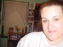
take your picture you are using and paste as a new layer
once that is pasted, if its too big and you can't use it as is pasted,
i resized once with 40% smartsize,
all layers not checked,
on top on psp you will see adjust, go there, then you will see when the menu pulls down, brightness and contrast
find the one that says histogram stretch
just click it and it does it for you automatically
then under adjust again, you will find automatic color balanceopen that up
strength= 72 and temperature= 4639, UNLESS you want to fool around and do it your own number for the temp merge visible both layers
once its merged, on top of psp you will see layers, click that and you find duplicate,
click that once
once you duplicate it once, do it one more time
ok, on the materials again, you will see 3 layers, merged, copy of merged 1 and copy of merged 2, right?ok, click the middle layer on top of the merged
ok, back to adjust, then you will see blur, when that opens, click the blur one once, you won't see it being done but its doing it lol
then back on the materials with the layers, the one that has 100, lower that to about 54%same layer
then click the top copy layered and you will see were it says normal
click on the normal and find the soft light option ok, merge visible again
set this image aside for now
take your 41*101 image we made
same picture too
take the picture you have and paste it into the 41*101 as new layer
take your mover tool
and move the pic around to the part you want showing
depending on the size, i did mine once at 40% smartsize, all layers NOT checked
if that makes it too small adjust the number size
then use your move tool (hit m on keyboard) and move the layer around to what you want showing
once happy, merge visble both layers
repeat the same step for the brightness and contrast, under adjust, once there, click the histogram stretch
then back to adjust and click on automatic color balance, same settings as before
merge visible both layers
this part is optional
Mirror if you want, depending were your placing the 41*101 image
back to layers on top of psp and click that,
find duplicate again, click it, do it again, to have 2 layers
click the middle layer
back to adjust, then same blur as before
and lower it down to 54% again in the material boxes
then top layer, click on that, then click on normal and find soft light again and click on that. Once you finish that, merge visble again.
repeat the brightness and contrast again, same histogram stretch one
automatic color balance, same settings as before
copy this image
once it copied, bring your 100*100 back up and paste as new layer on there
ok now this part is totally on how your images look.
your first layer, the 100*100 one, move that slighty over, to either the right or left a littleto where it isn't overlaping depending were your going to place your 41*101 one just move it to what you want to show ok, now back to the 41*101 layer
move this layer some so its not overlapping your other image, enough so no background will show and line them up.
if you need the other one moved, do it, so it lines up nice.
merge visble
Find your pen tool, click that
pick a color that goes with your image but a tad darker
line style is solid, make sure its on that, width = 3.00
once that is set, click back to your image, hold shift down and draw a line were the two images meet, then convert to raster
make a new layer
now the color you picked, flood fill with your color you picked on the new layer
add new raster layer
flood fill this with your next color, which should be light
on your DARK color, click on normal in this layer and change it to screenon your LIGHT color, change the normal to hard light
now click shift D together so your image duplicates as allset aside your originaland stay on the duplicate one
merge visble the duplicate image all layers together once that is done,
click shift T together
then do the same automatic color balance, same settings
copy the image we just fixed
click your other 100*100
select the light color layer, paste it as new layer on there
so its between the dark color and then light color is below it
change that layer from normal to Luminance legacy
make a new raster layer again
pick another color, that goes with your others but not too dark and not too light,
does NOT have to be gradient
I used a solid color. Flood fill the new layer with this color.
change this layer from normal to screen
after you change it to screen, click this layer in materials and drag below the dark color
staying on this layer we just dragged, take the brush image you saved, either open it or if its opened, copy it, paste into this layer as paste into selection
change the brush/color layer from normal to screen
Lower this layer to about 50, play around to what you like
ok copy the border pic from supplies
paste as new raster layer on your 100*100 your working on
so its the first layer, we don't move it
change the normal to overlay
play around with any of them till you like it for your colors
merge all layers visble
Font time
i used Trebuchet MS
size 1
no stroke, bold,
anti-alias on sharp, kerning 100
color white unless you want different, this text we won't be able to read,
but it makes it look neat
type out anything you want that goes with the pic
once your done
convert to raster, then add drop shadow with these settings
V&H = 1 Opacity = 93 Blur = 1.00 and color is blk
Add anything else you want and your done :) Hope you enjoy.